PS Logo
Thinking about the PS logo and how it all started, it makes me think about every entrepreneur and how important a logo is for every brand or venture. In my case, I was guided by what I like - what I believe in, what is part of me. That makes me feel that it carries an essence of mine, which subtly can be appreciated. Maybe without realizing it, I have my magic, the magic I believe in, which I am creating at the same time.
Let me tell you...
Since I was little I loved everything that was Mexican, and believe me, just because you are Mexican, you don't automatically like it. I remember as a child wearing Mexican necklaces, backpacks, anything that was made by artisans and indigenous people from different parts of the country. That taste never changed, so from the beginning I wanted the logo to have a Mexican touch, or something familiar with some indigenous crafts.
In 2016, I myself came up with the Punto Suave logo in a notebook, and asked a designer to digitize it. It had a simple font, hung a Huichol god's eye with a colorful pompom and a simple slogan that read "beauty products''. (see image)

When I arrived in Panama, I continued with that same logo but as a distributor and not as an image on a final product for customers to see. Let's remember that at that time I applied hair treatment and distributed in Panama two brands: LeChulier and Santa Madonna.
In 2018 when I started selling the elysian cream in a plastic container, when I added the image, mmm, the truth is that it did not look good, and less in the plastic bottle in which it was packaged at that time. And since the cream was starting to be sold with that image, I thought it was time to change it, so I asked a new designer for logo options and of the three proposals she sent me, the first one was based on the Mexican concept, but with a touch of exclusivity, and it looked more corporate and professional.

The isotype was born taking the idea of the pompom that was used, combining it with a style that gives the ideaof being a fabric like the ones used in Mexican handicrafts.. The slogan was "natural cosmetics", and the color palette chosen in the blue poblana talavera which is a true Mexican beauty (I'm sure you've seen it on a plate in a Mexican restaurant). This did not convince me at all, because in my mind I imagined the isotype to be more colorful, as in Mexican embroidery, but without falling into the folkloric.
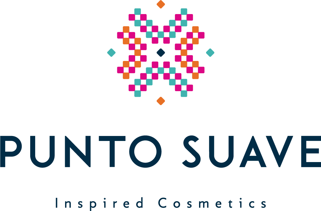
AWhen I asked the designer for something more colorful, she sent me a file with 5 options, all of them beautiful. But I fell in love with one of them: 
Until that moment I couldn't decide on the slogan, after days I realized that everything that was happening was part of an inspiration: in highlighting the beauty of the skin with special formulations, in nature, which provides us with everything we need and in women. And I thought, Inspired Cosmetics!
I went directly to google the word inspiration and this is what its meaning says: stimulus or sudden lucidity that a person feels and that favors creativity, the search for solutions to a problem, the conception of ideas that allow to undertake a project, etc., especially the one that the artist feels and that drives the creation of works of art. That was it, I finally had it.
And that's how we finally have the Punto Suave logo. Designed by Aletza Saav

This whole process is to show you that, that's just what it is: a process. It doesn't happen overnight, and how long it takes is not an indication of lack of success, nor of success either.
If you are an entrepreneur, I hope this will help you find inspiration and create what you want, knowing that with patience, love and taste for what you do, you will be taken on an incredible adventure and a lot of learning.


Leave a comment
This site is protected by hCaptcha and the hCaptcha Privacy Policy and Terms of Service apply.